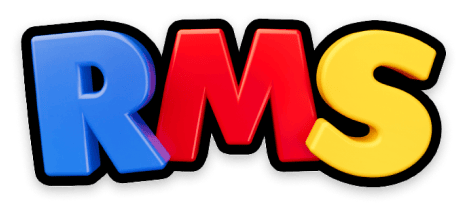
The official RMS USA rebrand is finally here, and we couldn’t be more thrilled! With a killer new office space and a fresh logo rolling out across merchandise, we knew it was time to define the remaining pieces of the brand.
We collaborated with our neighbor Bonfire Studios for our rebrand and epic custom website build. After months of insightful (and lively) conversations and workshopping, we discovered what finally makes us feel like us! Together, we captured the joy, creativity, and energy that defines our team, and turned it into memorable brand visuals (and will continue to do so as we add new products!).
We started out by digging deep to define everything RMS stands for: bringing the magic of play to everything we do, creating endless “WOW” moments, and making the coolest toys. Period.
These ideas are the driving force behind what we do every day and served as our guiding principles through the rest of the journey.
"As we aim to accelerate our growth in the toy industry, it's crucial that we start by reinforcing the foundation that makes RMS unique. This begins with clearly defining our vision and mission—not only for our external partners but also for every member of our team. With the launch of our new website and an updated brand identity, it's the perfect moment for us to introduce RMS to the world and show who we really are."
-Zack Farber, CEO
First up was a new color palette. One of our biggest challenges was determining how to distinguish the RMS brand from our many sub brands. Realizing that less is more, we leaned into our new logo and reinforced its colors: blue, red, and yellow. These primary colors are bright, fun, and kid-centric, which is exactly what we’re about. Together, these colors serve as a strong anchor for the main RMS identity while supporting our many other toy brands.
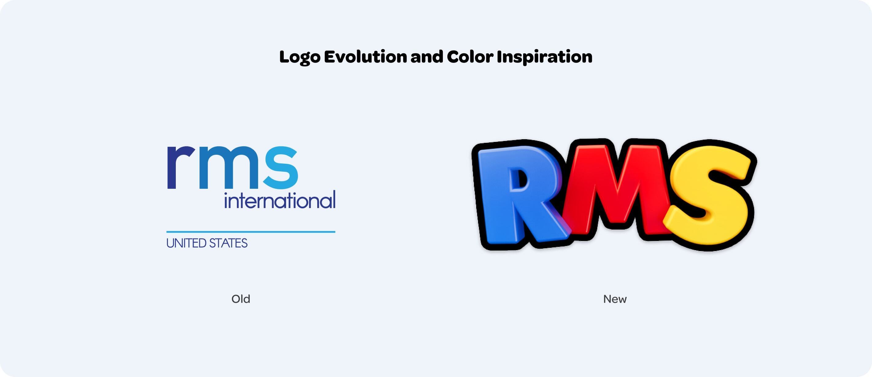
Next on the list was typography. Knowing that a word’s appearance can make a big impact, we knew that our font needed to be playful. Omnes was the font for us, and we use it for everything. The springy curves in Omnes’ letters have the same friendly appearance as the logo while still feeling professional.
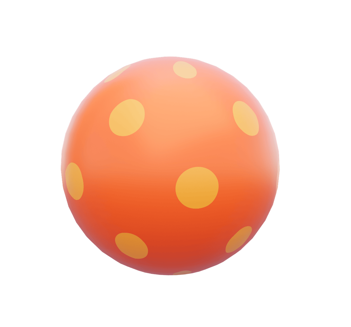
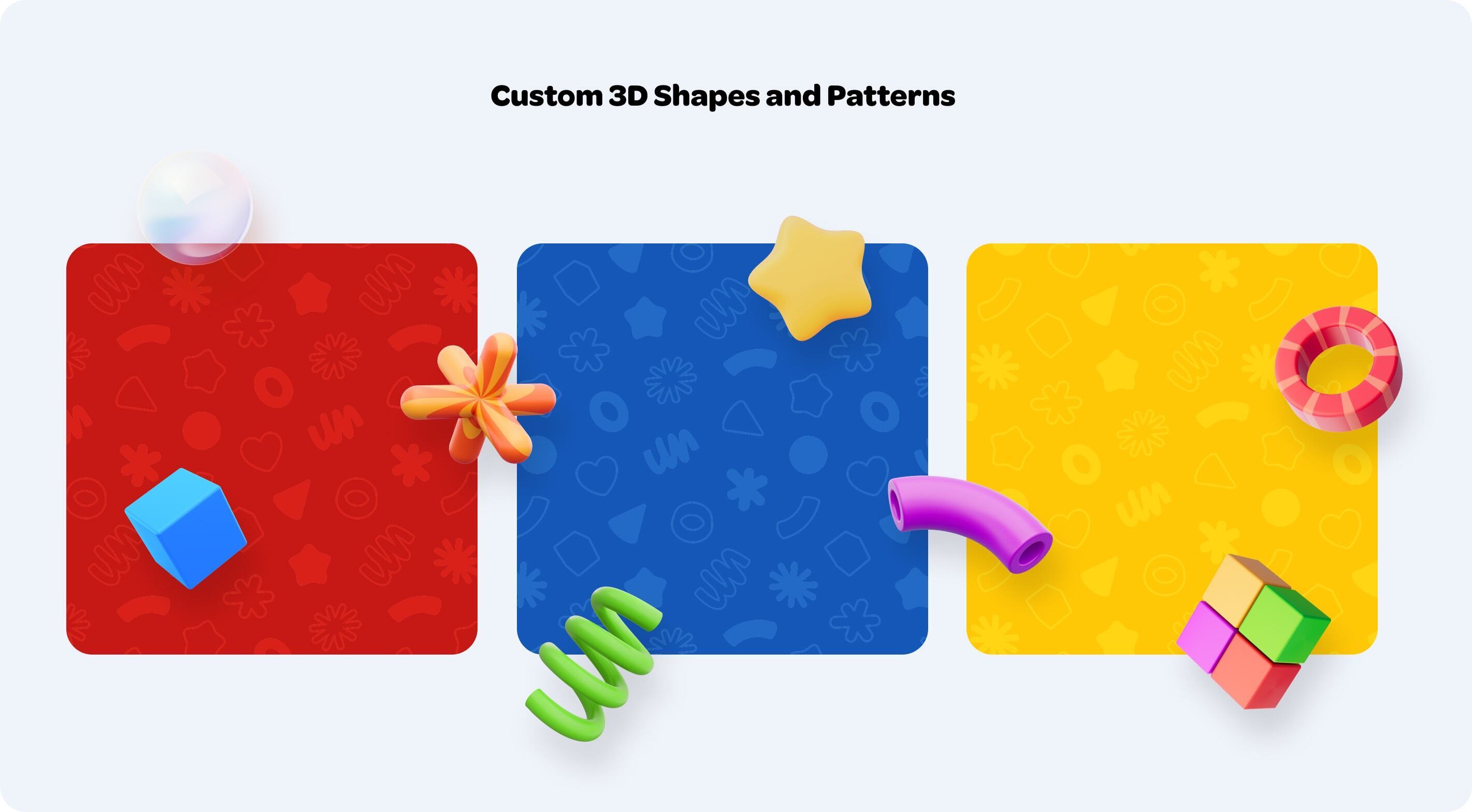
The final piece of the brand puzzle - the one that really distinguishes the new brand - is easily our favorite. Bonfire created a custom library of whimsical 3D shapes inspired by our own toys after a visit to our showroom. Not only are these shapes fun standalone elements, but their silhouettes were turned into patterns for use as backgrounds and textures. You’ll see the 3D shapes throughout the website - try interacting with them!
Our new website was built on Craft CMS, and we think it delivers on the “WOW!”. All the new brand elements are on full display, featuring fun layouts and unexpected animations. The site delivers the same thrill and delight visitors feel when they arrive at our showroom, which was very important to us from the start.
Our highly anticipated rebrand establishes RMS USA as a bold and unforgettable player in the toy industry. We can’t wait to see what the future has in store for us!
